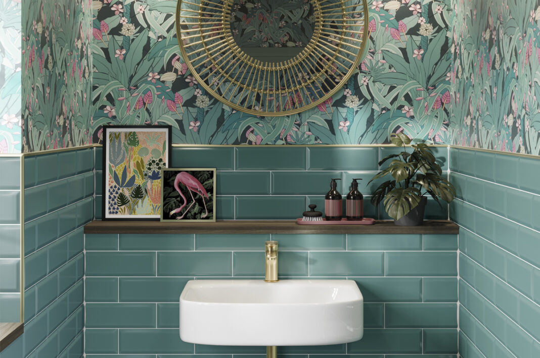
Jayne Adamson, Marketing Manager at Verona, discusses how to restore some tranquility with green and blue coloured tiles, and the importance of small formats and different glaze finishes.
Blue and green shades fluctuate in popularity every few years and can be seen in a variety of guises depending on the fashion trend and directive influencing colour choices.
While grey and monochrome are core staples of any tile range, blues and greens are also always in demand, bringing balance and tranquility to interiors as well as pops of colour.
Over the years we’ve seen soft pastel shades appeal to the feminine senses while rich emerald and sparkling sapphire tones exude glamour and Art Deco influence. As trends gravitate between soft and dramatic interiors, it’s not always obvious where best to invest.
Stock up on small formats
Coloured tiles are always best in smaller sizes, so build up a portfolio of a few different blue and green shades which reflect this.
Large coloured tiles are a daunting thought for many homeowners, especially for those who are on the fence about taking the leap into colourful interiors. That’s not to say small formats can’t be used to cover large spaces. In fact, they are perfectly suited to shower walls and kitchen splashbacks and offer a little creative freedom with their compact layout.
One size (or shape) doesn’t fit all
Small format doesn’t have to mean metro, although they are the most popular choice. Tile formats have evolved in the past few years and you can now get just about any shape in a ceramic or porcelain design.
Triangles, squares, elongated rectangles and diamonds; the sky is the limit.
A look sought after by modern homeowners, the hexagonal tile has made its mark in recent years, cascading down the wall and onto the floor for a sweeping design which draws influence from high end hospitality.
Perfect for an open plan wet room or zoned area for a freestanding bath, hexagonal tiles offer something completely unique and elevate interior surfaces with ease. These tiles can be laid in any direction as they piece together like a jigsaw. Tessellated seams enhance the look further for a bespoke design.
While the classic metro will always be around, we’re seeing more versatility when it comes to format. The elongated metro brings a modern touch but still yields the comfort of the metro which homeowners have grown to know and love. The beauty of the elongated format is the many ways in which it can be laid. There is the usual chevron and basketweave looks and the traditional stack bond style, but thanks to the extra length they can also be laid vertically to create a generously sized splashback.
Shade and shimmer
There are two very dominant looks on the market: pastels and jewel tones. While pastel tiles tend to have a matt finish to really focus on the powdered colour, jewel tones ooze opulence through glossy, iridescent finishes for an effect that is akin to real precious stones.
From tropical-inspired turquoise to the palest of aquas, steel grey-blues to cool, nautical navy, blue really does come in a whole host of sensual shades; it’s choosing where to start which is the hard part.
Similarly, greens span the spectrum, from sage to pine and everything in between. A subtle nod to nature, green tiles create a space which feels clean, airy and tranquil. Combine with natural stone textures and wood to complete the scheme.
To find out more about Verona’s range of wall and floor tiles, visit www.veronagroup.co.uk


